
Showing Activity
One of the metrics I track is showing activity. I started tracking this metric with my office showings when they scheduled through IRES, but my methodology has changed over the years, as all things do. Eventually the IRES system fell out of favor and many offices moved over to ShowingTime, a trend that seems to have accelerated over time and has led to a point today, where I feel the majority of showings in the Denver Metro area are scheduled through ShowingTime, where I now pull my data from. There are still other showing systems out there; IRES, BrokerBay, individual agents, etc., but my experience setting showings is that the vast majority get put through ShowingTime, which is good and bad from a stats perspective.
The good, one data source used by most people makes life easier and more consistent. The bad, that data source has some quirks to it. Quirk one, I feel the way in which I pull the data from ShowingTime has the chance of including some small number of scheduled appointments that aren’t showings, things like inspections, appraisals, walk-throughs, etc. This quirk doesn’t seem to include all non-showing appointments, seems to occur randomly and ShowingTime doesn’t have a solution to remove the non-showing activity. Quirk two, garbage into the system. I’m sure all of us have had a home inspection set on one of our listings as a showing with the Buyer’s agents’ name in place of the home inspector. Quirk three, as a ShowingTime subscriber, you are only allowed to see data for the MLS systems you belong to. So, if a Pikes Peak agent sets a showing on a Boulder County home, that showing won’t show up in my data download. Quirk four, Boulder County is in the overlap area of two different MLS systems and ShowingTime handles the classification of showings by area in a unique manner (more below). Having said all of this, I believe the quirks are a small error factor in the greater showing numbers, and these quirks are consistent over time, so the overall effect isn’t noticeable. So, here is my take on showing activity in Boulder County. This is Showings per Active Listing for all price points and all companies that use ShowingTime.
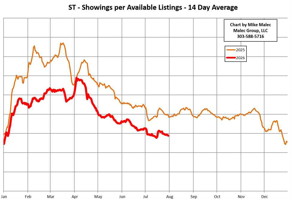
Always interesting to be able to see the showing dips around major holidays and the overall seasonality of showing activity. I’ve been asked in the past why there isn’t a vertical scale on the left side of the chart and I’ve intentionally removed that as I feel that number isn’t very meaningful as the data is averaged over two weeks, includes all price points, areas and properties that have been on the market for a single day or for a year. Hard to take that global info and apply it to an individual seller. I use this chart as more of a market activity comparison year over year.
As part of my occasional error checking of my download methodology, I pull all showings in the ShowingTime system for a particular date, which contains some interesting data about where showings are happening across metro Denver.
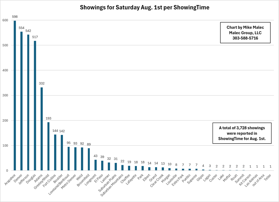
As part of the quirks in ShowingTime data, you’ll see some of these Columns are cities, some are Counties, and some are general areas. You’ll also notice some duplicates, Denver & Metro Denver, Weld & Greeley/Weld. Lastly, Boulder is actually City of Boulder and not Boulder County, quirky data indeed.
Upper 90’s as I write this, can’t wait for summer to exit!