
FHFA’s HPI index is our best source for overall market appreciation data. The dilemma, the data is very delayed. We now have Q2 2026 data, which would include some sales that went under contract as early as in March 2026. So, we can use this data to see where we’ve been, but the data to show the most recent changes to the market really won’t show up until later this fall. So, with those caveats, here is the Q2 FHFA HPI Data.
From the most recent HPI report– U.S. house prices rose 2.1 percent between the second quarter of 2025 and the second quarter of 2026, according to the U.S. Federal Housing (FHFA) House Price Index (FHFA HPI®). House prices for the second quarter of 2026 rose 0.3 percent compared to the first quarter of 2026. FHFA’s seasonally adjusted monthly index for June remained unchanged from May.
Significant Findings
· Nationally, the U.S. housing market has experienced positive annual appreciation each quarter since the start of 2012.
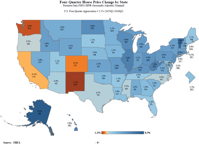
· House prices rose in 46 states and the District of Columbia between the second quarter of 2025 and the second quarter of 2026. The five states with the highest annual appreciation were 1) Alaska, 8.3 percent; 2) Vermont, 7.3 percent; 3) Hawaii, 5.8 percent; 4) Illinois, 5.6 percent; and 5) West Virginia, 5.6 percent. House prices were down in four states. New Mexico experienced the most significant price decline at 1.2 percent.
· House prices rose in 76 of the 100 largest metropolitan areas over the previous four quarters. The annual price increase was the greatest in Elgin, IL at 7.7 percent. The metropolitan area that experienced the most significant price decline was Everett, WA at 3.7 percent.
· All nine census divisions had positive house price changes year-over-year. The East North Central division recorded the strongest appreciation, posting a 4.5 percent increase from the second quarter of 2025 to the second quarter of 2026. The Pacific division recorded the slowest appreciation slightly above 0.0 percent.
Trends in the Top 100 Metropolitan Statistical Areas are available in our interactive dashboard: https://www.fhfa.gov/DataTools/Tools/Pages/FHFA-HPI-Top-100-Metro-Area-Rankings.aspx. The first tab displays rankings while the second tab offers charts.
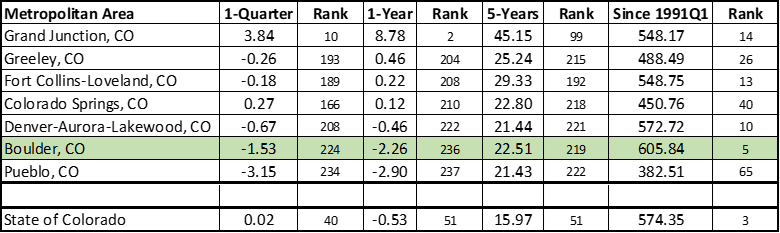
Here’s a look at how these numbers played out for the MSA’s in Colorado compared to the 238 other MSA’s across the country (that made this report) and how Colorado compared to the other states plus the District of Columbia. This data is based on the FHFA HPI “All-Transactions” index, which I feel is a better representation of the market than the “Purchase Only Index” used in the Top 100 rankings above. Boulder County slipped to 5th place for appreciation since 1991 across the entire country and has also dropped against the other MSAs in the state. The chart below is sorted by the 1-year appreciation rankings. I’m usually surprised by some of the findings in this report and this one didn’t disappoint. I don’t know what is happening in Grand Junction, but they are hot, #2 in the country over the last twelve months. Pueblo has had some hot showings in the last several years, but in this report, they have slowed dramatically, down almost 3% over the last year.
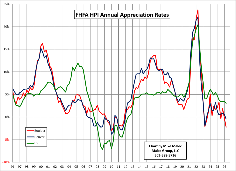
Here is a graph comparing the annual appreciation rates for the Boulder MSA (all of Boulder County), the Denver MSA (the City and County of Denver, Arapahoe County, Jefferson County, Adams County, Douglas County, the City and County of Broomfield, Elbert County, Park County, Clear Creek County, and Gilpin County) and the overall US. Interesting to see Denver has reclaimed the lead in the perpetual race between Boulder County and the Denver Metro area. We’ll have to see if this trend continues as well as the trend of the Boulder and Denver MSAs underperforming the overall US reading.
The national map, color coded by appreciation over the preceding 12 months. We’re one of the few states in the wrong color!
I think many are probably surprised by the just over 2% drop in prices in Boulder County for the past year. Do remember that this data is for Single Family and Attached. With the deep struggles in the Attached market, their weakness is pulling down the overall County numbers. As always, you need to look at the individual town, neighborhood or possibly even the street to really get an accurate picture for what is happening to a certain property.
I’m glad the temps are finally cooling off and I am looking forward to football!